What do we think?
Why we care about User Experience Psychology
One of the things we decided when we started EQ was that people would be at the heart of all we did. It wasn’t going to be all about money and stuff, but partnerships and helping people win. This isn’t just a nice thing to say or a gimmick, this is the backbone of everything we do here, and website design is no exception.
User Experience (UX) has become an important part of any design process, and it is a huge part of our journey when we are helping our clients design and develop a new website.
So, what can you bring from psychology to UX?
Psychology is the scientific study of how people behave, think and feel. So, the way somebody behaves, thinks and feels during their journey through your website could be the difference between them making a connection with you and your brand or going somewhere else. With this in mind, we follow some important principles when helping our clients get a website win.
We can’t take credit for the following four principles, as they were originated by people far more intelligent than me! But we do use these human behavioural laws most days.
1. Hick’s law
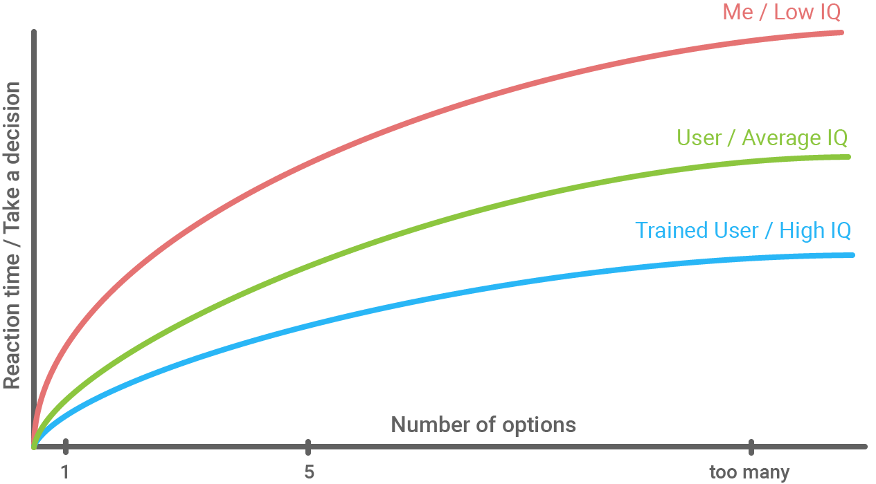
Or the Hick–Hyman Law, named after British and American psychologists William Edmund Hick and Ray Hyman. This Law states that the more options a user has, the slower they will respond. This means that by removing extra options from the user, they will be able to find the solution to their problem more easily.
So, how do you apply Hick’s law to your web design?
The trick is to get the right balance of – enough choice, so the user feels like they are deciding on the journey they take, but not too many options that make every stage long and painful. Remember to keep things simple; why use two steps/buttons when one will give the user the same outcome.

2. Fitts’ Law
In 1954, psychologist Paul Fitts came up with this law. This isn’t only for website UX, but in this context, Fitts’ law states that the amount of time required for a person to move a mouse cursor to a target area on your website is a result of the distance to the target divided by the size of the target. So, the longer the distance and the smaller the target’s size, the longer the action takes.
Why should I consider Fitts’ law for my website?
Have you ever found yourself getting frustrated when you can’t find the ‘view cart’ button or ‘buy now’? Mistakes like this can cause your users to give up, and you might lose them from your site altogether. Remember, if a user has to look for a small button on a page, chances are they won’t find it. It’s worth considering the following –
- Target areas should be big enough for users to select them accurately
- Target areas should have enough spacing between them
- Target areas should be placed in areas of the website that allow them to be easily accessed

3. Jakobs law
Jakob Nielsen, a Danish web usability consultant and human-computer interaction researcher, stands by this principle which has become a law to many useability professionals. The law states that ‘Users spend most of their time on other sites that are NOT yours.’ So this means that users would prefer your site to work the same way as all the other sites they already use.
How can you use Jakob’s law on your website?
As humans, we develop learned behaviours. So when a user sees a hamburger menu on a mobile app or website, they know how that is going to work when clicked. You need to get the balance of original design built around common learned website behaviours.
- Users will transfer behaviours they have learned around one familiar product to another that appears similar.
- Using existing learner behaviours, we can create superior user experiences in which the users can focus on their tasks rather than on learning new behaviours.
4. The isolation effect
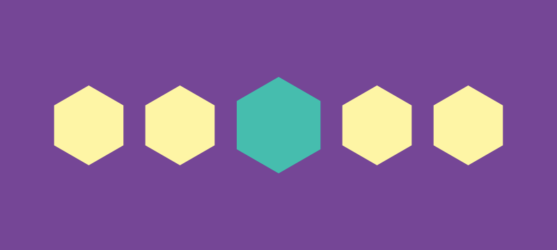
The theory (also known as the Von Restorff Effect) was coined by German psychiatrist and paediatrician Hedwig von Restorff. In her 1933 study, Restorff found that when participants were presented with a list of categorically similar items with one distinctive, isolated item on the list, memory for the item was improved.
Why should the isolation effect matter to me?
Taking this into a website user scenario where multiple similar objects are displayed, the one that differs the most is likely to be remembered. People value a thing differently depending on whether it is placed in isolation and whether it is placed next to an alternative. In particular, a certain choice can be made to look more attractive if it is placed next to an alternative option to which it is distinctively better in some respect. You should use this idea to guide your users to the desired action on your website. It might be a ‘free trial’ or ‘buy now’ button that stands out from the other button on your page by colour, shape or interaction.

Key takeaways
I would never confess to being the world’s best UX guru, but I’ve got to know people in the time I have been on the planet so far. I know that when it comes to websites, users want to think the least they have to, behave the most natural way they know how and feel immersed in their user journey from start to finish. So when designing your website, remember the above four laws/principles, and you are already doing better than many websites out there.
- Keep it simple – don’t give the user too many options
- Make sure to pay attention to the position and size of elements
- Don’t reinvent the wheel; use what users already know.
- Make your element stand out from the rest if you want people to interact
Need more help?
You can find out more about experience here 👉 thinkeq.co.uk/what/experience/
And if you’d some more help with your website, get in touch with us today!
👉 Start your project
We connect emotion with design, discover what counts and focus on what matters.
how we work
