What do we think?
At EQ, we have a pretty good team of experienced web designers that make us feel pretty confident about giving you our 5 essentials of web design!
Each one of these fundamentals contributes in their own way to the overall user experience. By following these web design do’s and don’ts, your website will not only look more professional but also convert your new visitors into paying customers. Trust us, we’ve tried, tested and succeeded. With all of this in mind, let’s get straight to it!

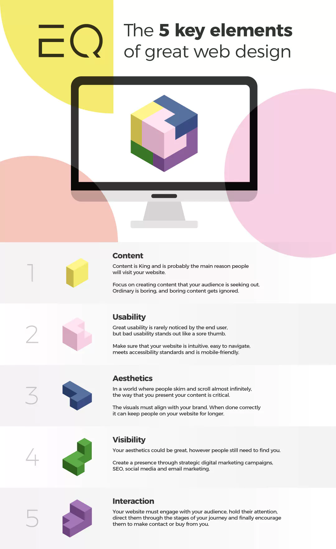
Here are the five key elements to web design:
1. Content
- Content is King – It’s the reason people are on your website in the first place!
- You really need to focus a great deal of effort into creating first-class content for your website, which should include videos, relevant news/information and relevant imagery. You want your people to stay! Your content is there to keep people on your website for longer and give them reasons to come back.
2. Usability – The end user will never notice great usability, but bad usability instantly stands out (trust us!).
- Your website needs to be easily navigable, intuitive, accessible and mobile-friendly.
- The user should be able to find the information they are looking for within seconds, know where they are on the website at all times, and be able to find where they want to go with little thought.
- They should also be able to access any page they need without having to view the whole site. Make their lives easier! That’s what they want.
- Your site should always be one step ahead – direct them to the page they are thinking about with as little effort as possible.
3. Aesthetics
- Your site is going to need to be visually impressive – with the brand image always in mind.
- It should reflect the visions and values of the brand and connect with the audience.
- Website visuals need to always create brand awareness and longevity in the mind of the audience, you want them to leave the website knowing exactly what your brand image is and what it’s about – this will always increase credibility.
4. Visibility
- Your aesthetics could be great, however you need to be able to be found. Create a presence through strategic digital marketing campaigns, SEO, social media and email marketing. These steps are crucial if you want your website to reach its target audience and full potential.
- Take the time to understand how to be found, what platforms to target and how to utilise your content.
5. Interaction
- Your website needs to engage your audience, hold their attention, direct them through the stages of their journey and encourage them to contact you. All the attention should be on them!
- Your website isn’t just there for show, it is there to help you generate leads, increase sales and grow your business – so make sure your website engages with your visitors in the most impactful ways.
I think we’ve established what are the do’s – so let’s establish some don’ts!
The worst thing you can do is have too much going on!
Too many colours, too many flashing buttons, and too many animations will distract from the reason people are coming to your website. We have all heard the saying “less is more” – and we agree!
Don’t think this means we’re boring! Oh no, we hate boring! The team here at EQ all love a wow factor – something impressive which or an unexpected feature can make your site unique, but there’s a fine line between the two. If you’re going to be experimental with flashy features then they need to compliment your website and be relevant to your brand.
This leads us on to our next point – Don’t try too hard.
Being unique or quirky can help you to stand apart from competitors, but it can also be damaging if it’s not done well. Remember! It’s all about the user experience. Adding in too many flashy features are not only distracting, but can slow down your site and even worse… people will be quick to leave.
We touched on content at the very start of this blog. However, too much content is just as bad as no content at all. We might be awesome at our jobs here at EQ but we are also consumers too, and we aren’t denying that as consumers we can be lazy!
We all want the quickest easiest experience, we want to know the answer to what we are looking for straight away. So, huge chunks of detailed text on your website? Yuk! Save it for your blog. Because, quite simply to put it bluntly – we just can’t be bothered to read it!
And if you don’t have a blog? Consider this as your sign to make one.
Having a blog allows you to show off who you are, what your company enjoys talking about, create content that signifies what your brand is about and connects with your audience. Having a creative writing style is what will set you apart from the competition here too. It’s your company’s space to be able to show a less serious side to the business, so have fun with it!
If you’re reading this blog and you already design websites, you know that making your designs useful and enjoyable is a top priority. However, even with the best web design software at your fingertips, it can be an overwhelming task for anyone.
So if you’re feeling overwhelmed, then leave it to us!
Find out more about how we work and get in touch with us today to get the ball rolling.
👉 https://thinkeq.co.uk/what/web-design/
We connect emotion with design, discover what counts and focus on what matters.
how we work
