Simple Life Homes

Simple Life Homes is part of Sigma Capital Group. They build neighbourhoods by delivering brand new, good quality, well-located family homes to rent. All the ‘little details’ are taken care of for simplicity, ease and peace of mind.

Brief
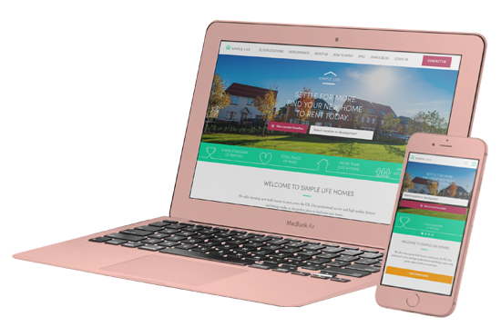
Simple Life required us to help them make their website work harder and bring their unique Emotional Selling Points online. The website looked great, but the user journey was long-winded and unintuitive. The site didn't tell the brand story, the terminology was confusing, and the user needed to delve deep to find the information they needed to take them through to submit an enquiry.

Approach
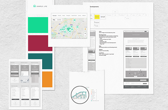
We researched a broad range of competitors and other property websites. During user testing, we uncovered that there were clear patterns to the process that users were going through.
Armed with this information and a huge range of other insightful data, we worked to undo then redo the user journey. We made it more delightful emotionally and more intuitive, while conforming to general online house-hunting normalities. This included introducing a sticky navigation and search functionality, and building adaptable, responsive modules so the website can easily evolve.

Delivery
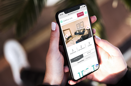
We separated what's significant to the user from what's secondary, ensuring they don't have to hunt for the information they need to make a choice. We created a more emotionally meaningful journey, by tailoring the images, messaging and information at each stage.
We worked closely with the client to ensure that the brand succeeded in showing understanding and empathy with the customers; presenting the information in a more consistent and rational order, using familiar language, and reassuring users that they were looking in the right place.
We got under the Simple Life brand's skin so we could bring their unique story online, marrying the brand personality with the users' wants and needs. We helped them develop a robust design language that can be echoed offline, enhancing the colour palette to help guide the user, and specifying design rules.
"We have now worked with EQ to redesign, develop and launch four websites. They take on a really nice collaborative approach and they truly feel like an extension to our team. No job is ever too difficult and everything from design to user experience is always well thought-out. We would very highly recommend their services!"
Vicky Hurcomb - Head of Marketing
Results
The website has been an enormous success. We continue to work with Sigma Capital Group to improve and evolve the brand online, contributing to achieving their goals and being part of their success. Through constant user analysis and improvements, the site is growing along with the brand.
-
35%
Average session duration increase across the year
-
13%
Improved bounce rates across the year
Our tried and tested approach ensures that our clients connect with the right audience.
how we work

