Switch Expert

Switch Expert aims to provide the very best Business energy deals from all major UK energy suppliers.
They approached us to create a unique brand and user journey that made it super easy for businesses to get a quote as quickly as possible.

Brief
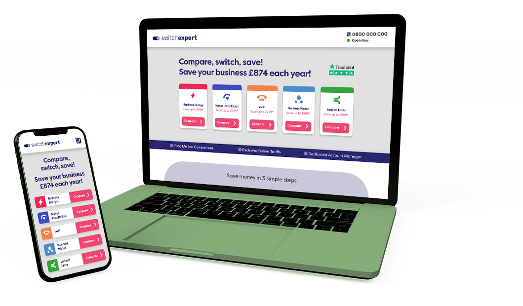
Our brief was to create a new brand and website for a new business energy comparison company. The brand needed to be simple, clean and modern, yet memorable. The user journey had to be quick and simple, to enable customers to get the information they need in minutes, with the goal of capturing contact information for the Switch Expert team to follow up on immediately.

Approach
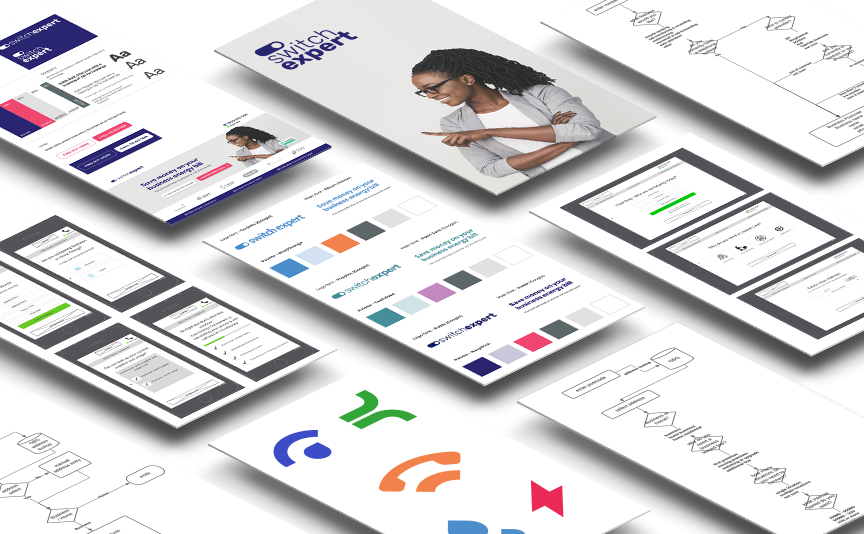
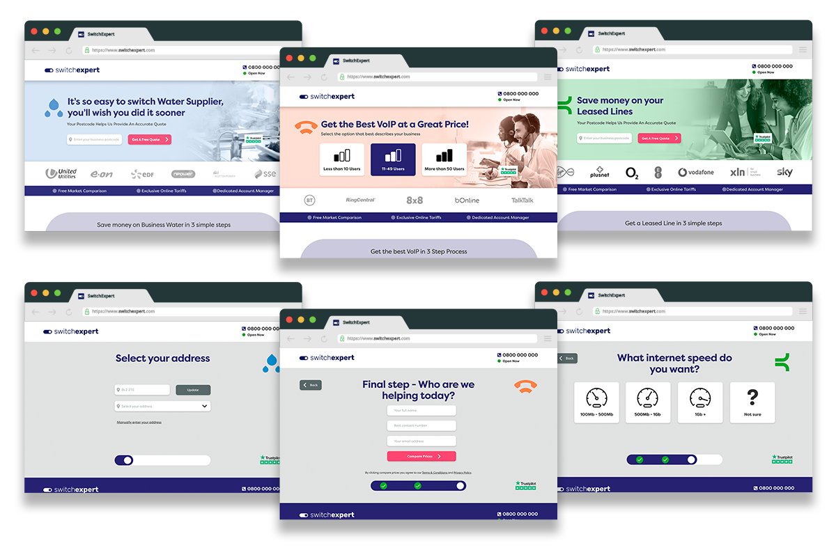
Whilst the structure of the site was simple, we needed to create multiple wizard forms, creating easy step-by-step questions, to enable us to gather valuable business-related conversion information. This information is then fed into our client's comparison engine via an API.
From researching the market and conducting a competitor analysis, our web design and UX team were able to produce a series of moodboards and wireframes, developing a brand and website design that encompassed the business name and ethos.
Our focus on listening to the user and market needs allowed us to remove unnecessary elements from the process, allowing the customer to complete the journey.

Delivery
We created a website that incorporates tailored product landing pages, each with clear content and simple CTA's - generating a click-to-lead ratio of around 20% within the first month.
Our teams haven't finished yet! They continue to test and optimise the website as we go into phase two, conducting ongoing behavioural analysis and mapping, to test, learn and revise the website as this project progresses.
Our tried and tested approach ensures that our clients connect with the right audience.
how we work

