What do we think?

Your favourite colour is orange so surely you should use orange for your brand right?
Nope.
Granted, we all have favourite colours and associations with them, but what happens when we SEE them?
Colours affect our emotions in lots of different ways. Once we identify a colour, we instantly have a chemical reaction in our brain that produces an emotional response. This response triggers a multitude of thoughts, memories and associations to people, places and events. Our brains are designed to react to colour in an unconscious way, as it happens automatically under our conscious awareness.
Do colours influence people when it comes to branding?
A brand’s choice of colours can be the difference between success and failure, they define how customers perceive the personality of that brand. You may have the coolest logo – but paired with the wrong colours? Useless. They aren’t just your logo colours, they are also the colours of your website and all other marketing collateral that will be your brand’s identifier.
Using the same colours helps build brand awareness.
Let’s put this into practice
If we think of Coca Cola…we think red – Which is also usually associated with love, energy, strength, and stimulation.
If we think Cadbury….we think purple – Purple is a royal color, usually associated with luxury, exclusiveness, high quality, and authenticity.
If we think of Facebook…we think blue – This colour connotes stability, serenity, trust, safety, harmony, and peace.
If we think of Starbucks… we think green –Green is often related to nature, prosperity, growth, and health.
We think you know how important colour choices are to us! So, here are some key factors that we consider when we are deciding on what colours to choose.
Ask questions at the start
- What is that the brand will offer?
- What are their values and visions?
- Do they want to be perceived as a fun brand or do they want to be known as serious and authoritative?
- Mature or youthful?
Audience knowledge is crucial, should the colours be masculine or feminine?
Researching competitors is another great way to determine how to be unique and stand out – and it should also help you gain knowledge about what works in the industry.
With all of this in mind…
Don’t underestimate the power of colour. When creating a brand, being consistent is key. Consistency in the colour scheme of a brand strengthens its identity in the market and gains the trust, loyalty and familiarity of customers.
We advise not to go OTT!
Being specific will ensure your colour choices will continuously strengthen your brand’s identity and increase the memorability of your brand in the eye of the consumer.
Keep it minimal!
We recommend researching your brand’s visions and values and then deciding on a small palette of two to three primary colours that represent the brand the best. It’s fine to add secondary and even tertiary colours – but these should all work with your main brand palette.
Choose a harmonious palette
Top tip from us – Before you think about choosing your colours you should think about the message you are trying to communicate. Once this has been established it’s easier to select your colours. Using a colour wheel can help you to make this decision easier.
Complementary
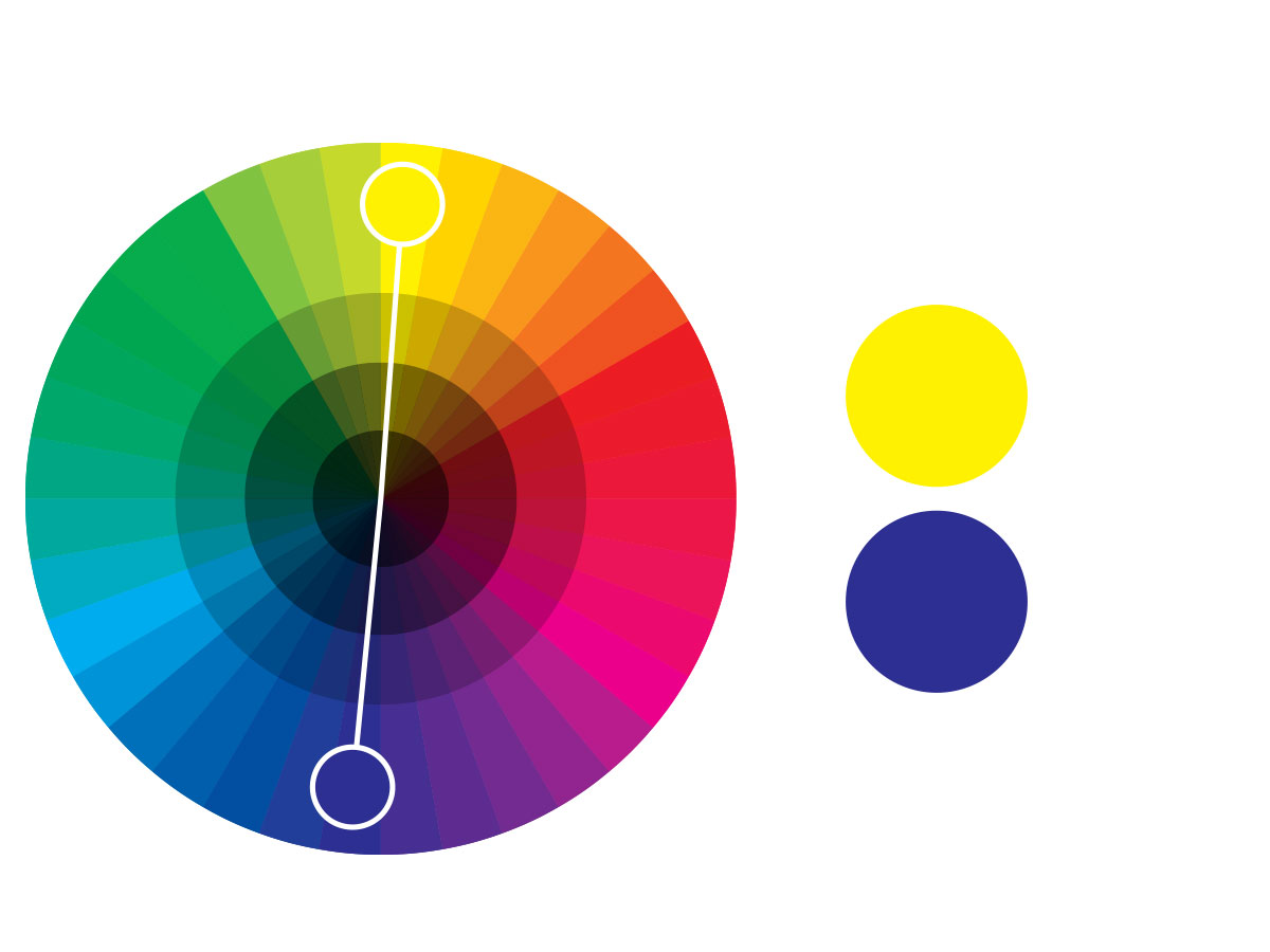
Opposite each other on a colour wheel (example: blue and yellow). The high contrast of complementary colours creates a vibrant look. Meaning, they work well when you want something to stand out but can make text hard to read.
Analogous
Next to each other on the colour wheel, similar to an ‘ombre’ effect. They match well and are pleasing to the eye. The easiest way to use this colour scheme is to choose one colour to dominate, a second to support, the third as an accent.
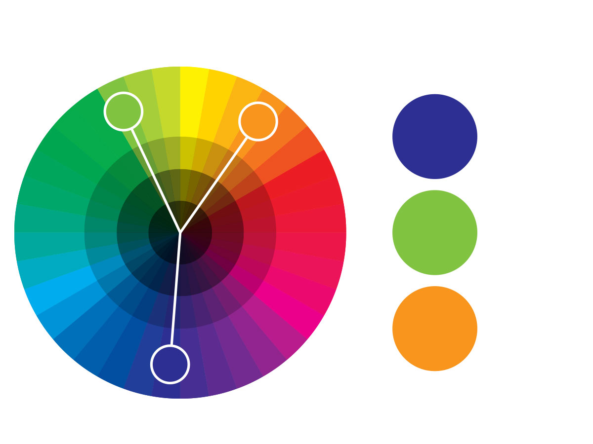
Triad
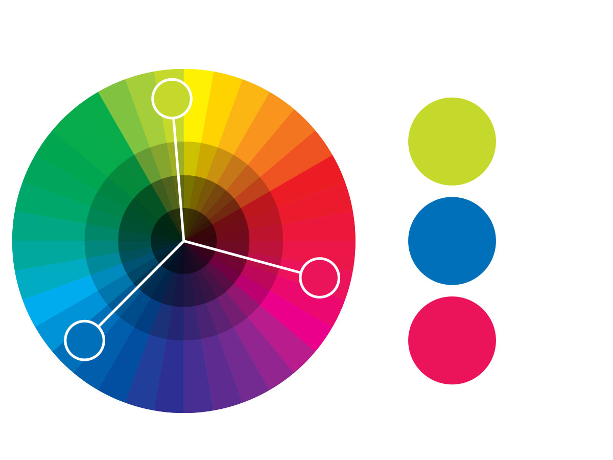
Evenly spaced around the colour wheel. Tend to be quite vibrant to grab the viewer’s eye but are not usually as contrasted as a complementary colour scheme as the third colour is used to diffuse the other two colours.
Rectangle and Square
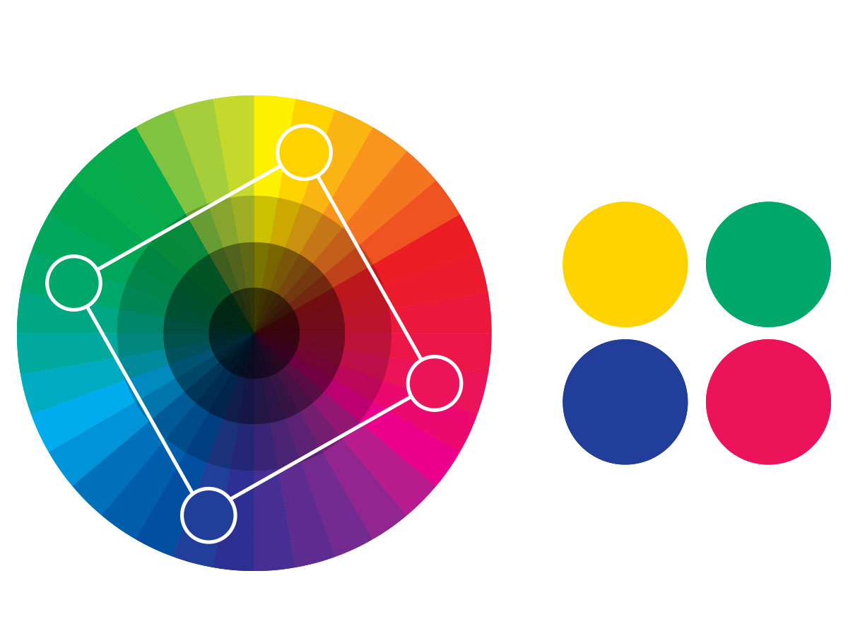
Both are very similar, by using four colours arranged into two complementary pairs. These colour schemes are successfully used when one colour is dominant and if you pay attention to the balance between warm and cool colours in your design. The only difference between them is that the square colours are slightly more diffused as they are slightly closer.
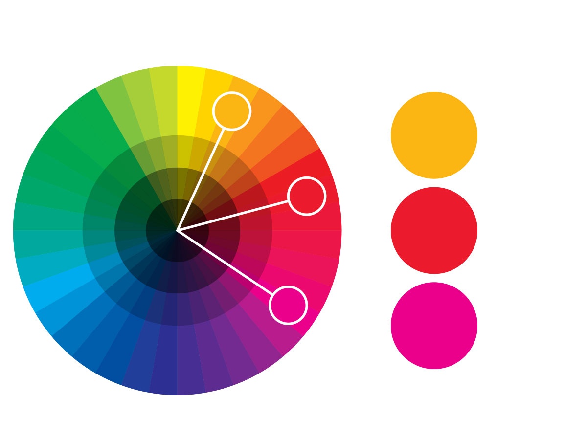
Split-Complementary
A variation of the complementary colour scheme however, a better choice to use when you want to make an impact, but don’t want to be too flashy. In addition to the base colour, it uses the two colours adjacent to complement.
Set yourself a little test
Next time you shop with your favourite brand, ask yourself why you think the brand chose those colours, do you think they work well when it comes to communicating their message and as a result do you trust the brand due to their colour choices.
Granted, you may provide several reasons based on customer experience rather than colour, but it also may be your subconscious colour preferences nudging you in their direction too.
Colour choice is just one part of successful branding. Your brand is your business’s identity and is so much more than a logo with good colour choice.
We would love to help you to bring your brand to life!
We connect emotion with design, discover what counts and focus on what matters.
how we work